Transparency is the New Speed: Why We Stopped Hiding Our AI’s Homework
How the Anagram loading state has evolved to keep users engaged, while simultaneously building confidence with customers.

In the old world of web design, speed was the ultimate north star. We were taught to shave off every possible millisecond, operating under the assumption that if a page didn't load instantly, the user would vanish. Traditional UX was about making the "wait" invisible.
But we are entering a new era of AI, and the rules are changing.
At Anagram, we realized that the "instant load" is often at odds with the "deep intelligence" users actually want. Anagram isn't just a chatbot; it’s an experience builder. When a user asks for a product recommendation, our AI agent is navigating a knowledge hub, checking modular skills, and following a brand’s playbook to build a new way of customer engagement.
We had to stop designing for speed alone and start designing for transparency. We realized that users don't mind a brief wait if they can see the "digital labor" happening on their behalf. Here is how our animation style evolved from masking the delay to showing our AI's homework.
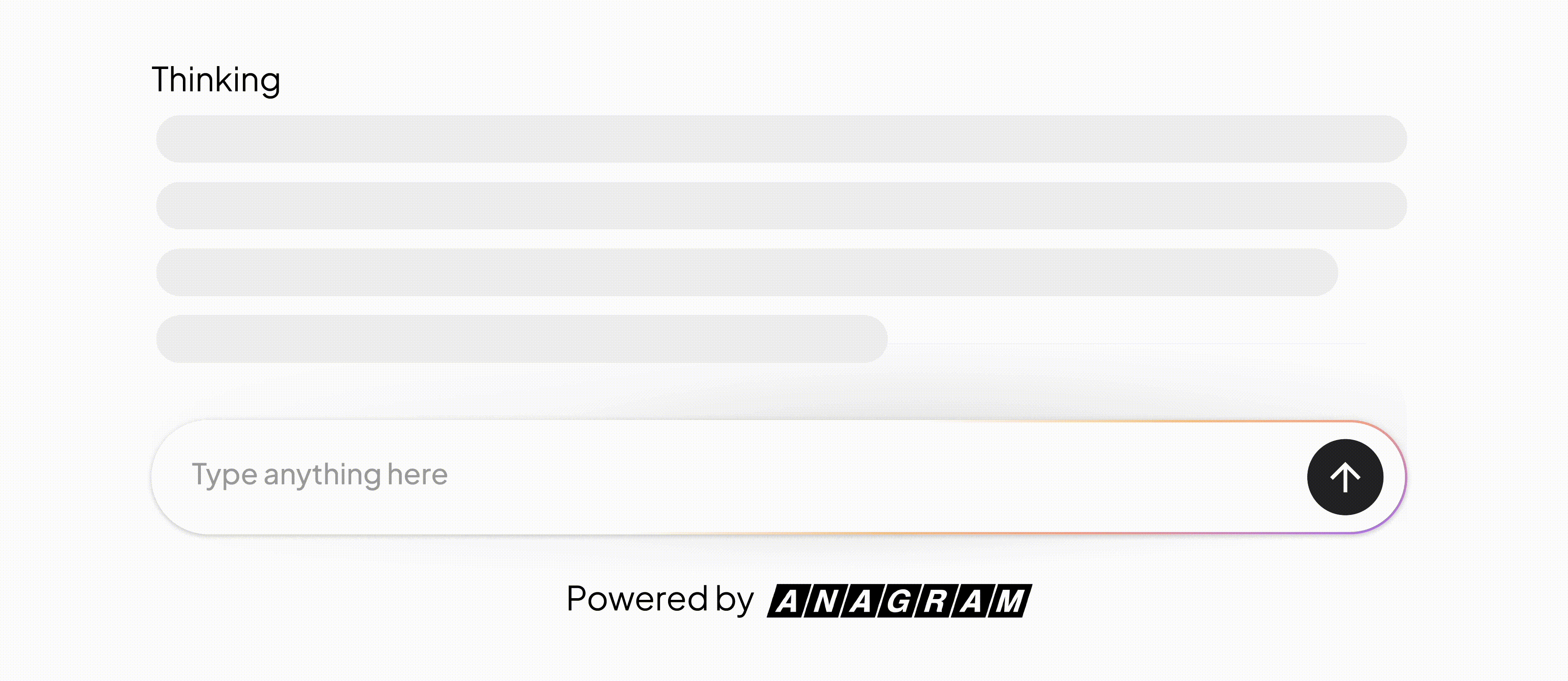
Iteration 1: The classic skeleton shimmer
When we first launched, we leaned on the industry standard: the skeleton shimmer. You’ve seen it everywhere—those gray, pulsing blocks that act as placeholders while the data fetches.
It works fine for a two-second API call. But Anagram experiences do a lot of heavy lifting. When a wait stretches past ten seconds, a shimmer stops looking like a "fast-loading site" and starts looking like a frozen app. The shimmer is a polite fiction that says "we're almost there," even when the agent is actually deep in a complex reasoning loop. For our users, the pulses felt hollow.
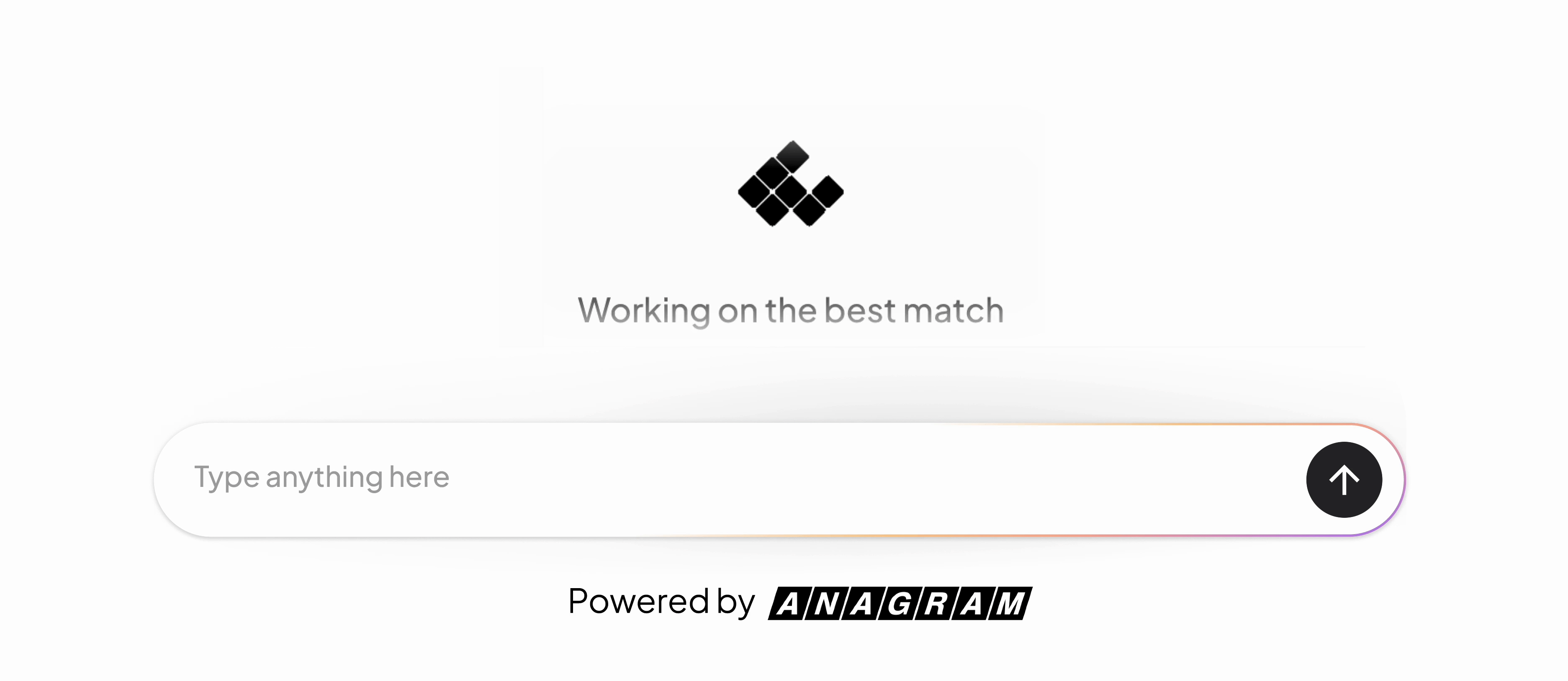
Iteration 2: The "keep 'em busy" animation
We knew we needed to keep the user engaged. We replaced the gray boxes with a Lottie animation that was more branded, fluid, and much more intentional. We also added a loop of customizable status messages like "Analyzing your style..." or "Searching the catalog..." to provide some context.
This was a massive upgrade in terms of personality. It felt like a branded experience rather than a loading screen. However, it was still a "black box." The user knew we were doing something, but they couldn't see the work. Deep down, we all have a radar for when we're being "entertained" versus when real value is being created.
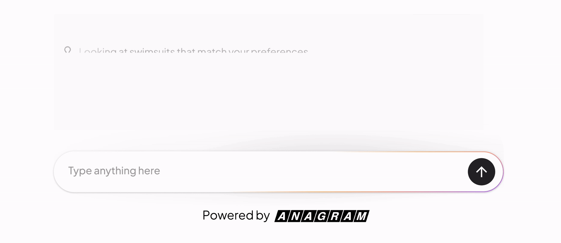
Iteration 3: Showing the "brain" in real-time
Recently, we introduced a more intelligent search that takes significantly more steps to find the perfect match. Ironically, this meant our load times actually got longer. But instead of trying to hide that extra time, we decided to expose the logic.
In our latest iteration, the UI reveals the "digital labor" happening behind the curtain.
As the agent thinks, the user sees a play-by-play. We show thumbnails of the actual products the agent is "scanning" in real-time. You see a flash of a hiking boot, then a running shoe, then a sandal as the Agent narrows down thousands of possibilities.
Even though this search takes a few seconds more than our original version, it feels faster. The wait time hasn't changed, but the perceived value has skyrocketed. By showing the thumbnails of products being considered, we build incredible confidence. The user thinks, "Wow, it actually looked at those 50 items and narrowed it down to these 3 just for me." The loading state is no longer a "necessary evil"—it’s proof of work.
The designer’s takeaway
As we move further into the AI era, we have to move past the "instant-or-bust" mindset. In a world of generative experiences, transparency is the new speed.
When you show the "why" behind the "wait," you aren't just filling time. You're proving value. We’ve learned that users don't actually mind waiting a few extra seconds if they can see the agent doing the homework they didn't want to do themselves.